Zaria: A Breast Cancer Survivor's App
Project Overview
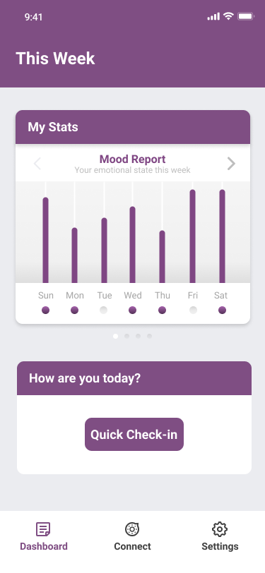
Breast cancer survivors face physical and emotional hardships after the sudden drop-off in support after having gone through treatment. Our solution focused on providing a platform for breast cancer survivors to track their daily journeys. The mobile app delivers personalized reports based on the user’s emotional mood, pain, appetite and pain data.
Team Members
- Joshua Galang
- Niharika Mathur
- Gurudutt Perichetla
My Role
- Brainstorming
- Business Model Canvas
- React.js
- HTML/CSS/JavaScript
Research
Interviews
Through a research lab at Georgia Tech, we were able to contact two survivors and a clinician familiar with the space. We asked questions to get an understanding of what their top struggles were and to better understand how technology may help address technologies pain points. Some of the key insights we gained are the following:
- A survivor may be fine during active treatment, then become depressed 6 months after treatment, indicating a need for tracking and logging platform.
- They have to handle realization of living with the risk of recurrence and ongoing side effects for a prolonged period of time.
- Difficult to handle the sudden drop-off in support after having gone through the treatment.
- Have increased emotional needs due to fear of recurrence, anxiety, and depression
Online Research
To gather background research, we also investigated online blogs and community resources for breast cancer survivors to get a wholelistic perspective on their experiences. Some important insights we gleaned from this research include the following:
- For emotional support, a major part of the journey is to rely and trust that the survivors have on their close friends, family and other survivors. A sense of community is a major source of support for the journey.
- A big use for the digital support that the users seek is mainly for two reasons - to record their journey and to validate the information received from their clinicians and doctors.
- The use of forums, blogs, websites and other community groups are very beneficial to keep track of survivor journeys.
Design
Concept Generation
Based on the research we had gathered, we started brainstorming potential solutions. We focused on sketching out three ideas with the most potential to address our user's pain points.
Idea #1: App to Track Emotional and Physical Status
Patient is reminded to record her daily status. She can also check her most recent trends.
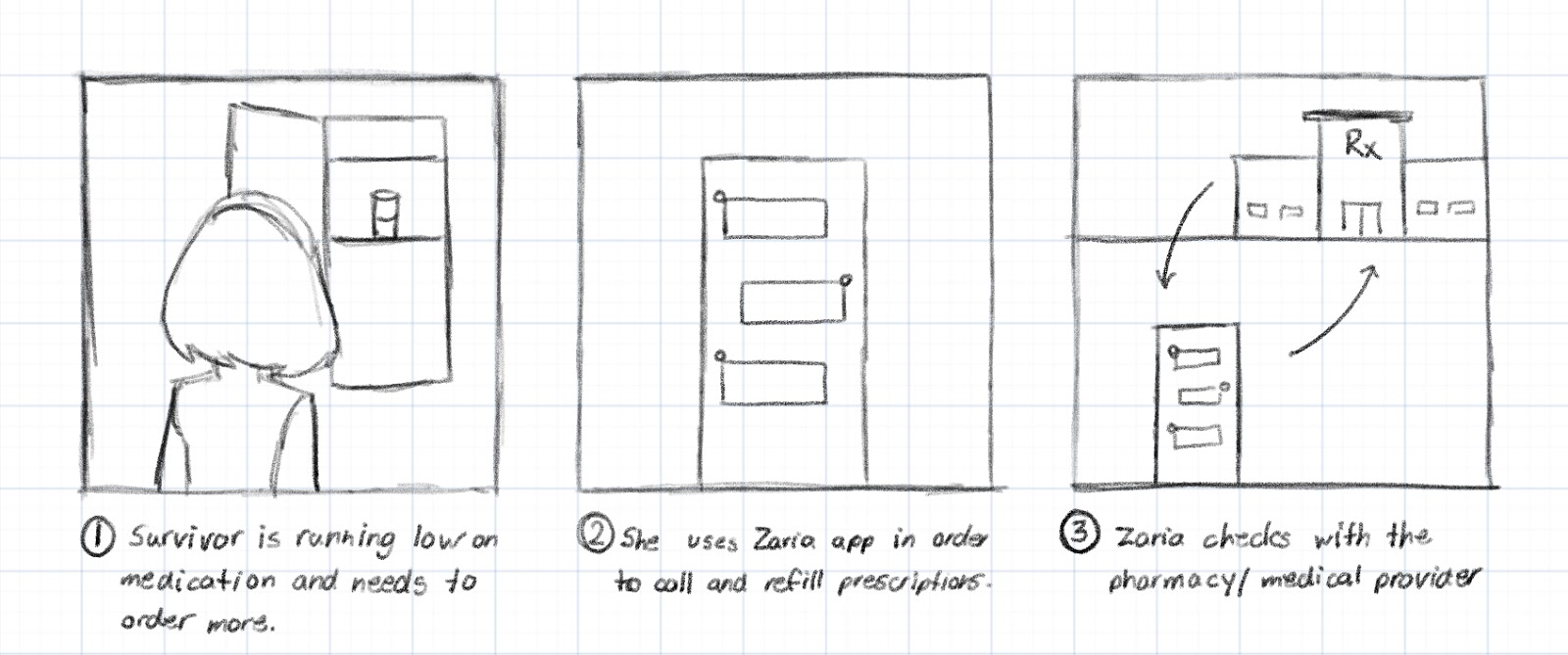
Idea #2: Chatbot for Managing Prescriptions
Patient receives prescriptions, scans them, and receives reminders of when to take them.
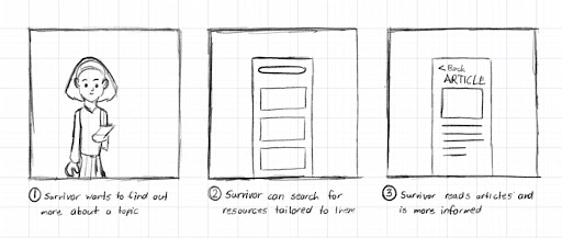
Idea #3: Mapping Tracking to Relevant Articles
Survivor receives personalized article suggestions based on their unique journey and symptoms logged.
After receiving feedback from users and advisors, we decided to pursue the first idea of an app to help survivor's log their personal and physical symptoms after their treatment had ended.
Business Model Canvas (BMC)
As we were designing our product, it was important for us to consider the business model and how our product could realistically be taken to market. To map this out, we created a business model canvas for our product.
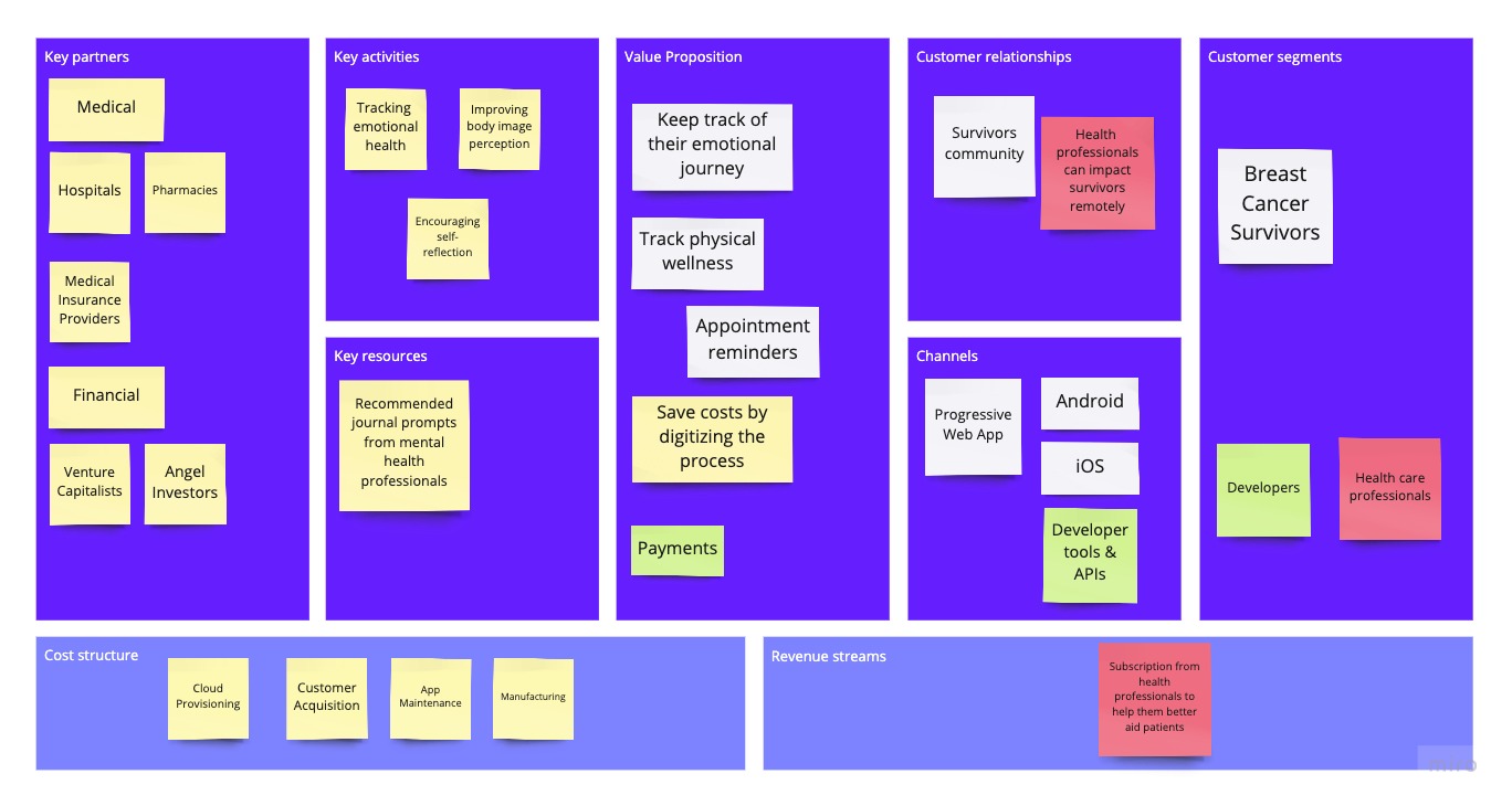
Originally, we only had breast cancer survivors as a customer segment and then our revenue stream was primarily from ads. However, we realized that ads were a bad combinination for an app that had emotionally vulnerable users. Therefore, we added health care professionals as a customer segment and changed our primary revenue stream to a subscription service that health care professionals would pay for to better aid their patients.
Development
Architecture
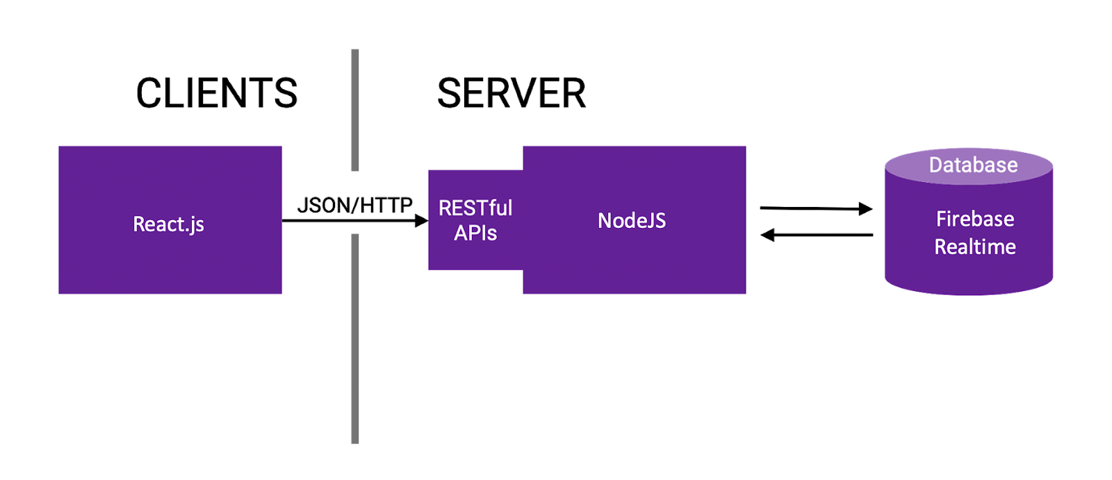
We developed in sprints for this project. In our earlier sprints, we began with developing in vanilla HTML/CSS/JavaScript to get a feel for the flow of the app and how things would be layed out. In our later sprints, we migrated that code into a React.js application. I broke the code into components for each screen and connected the app to our Firebase database for authentication. Our architecture diagram for the app is displayed below.
Final Solution
For our final sprint, since my team was not familiar with React.js, we decided to import the React.js components into Framer X, which allows designers to create screens that can be converted into React.js code. Transferring to this technology allowed my teammates to more directly contribute to our final project. The demo video below walks through our final prototype.
Next Steps
We compiled a list of potential future directions that the project might go into. Some of these directions are:
- Fully implement the cross-platform app with React.js and ensure there would be proper security and privacy considerations for the user's data.
- Expand to other types of cancer. We focused on breast cancer to narrow our scope but many features on our proposed application could be applicable and helpful to other forms of cancer as well.
- Include voice interaction. A major part of the app’s user interaction is empathy and that connection gets highlighted to a huge extent when the user gets the option of having an interaction through an audio interface.