Library Checkout Visualization
Project Overview
We chose to work with the Seattle Library dataset which has recorded the number of checkouts for any item checked out from their library. Our intent was to design a visualization that would help us find out what book and movie checkout trends have been like over the years.
Team Members
- Kelsie Belan
- Isabel Newsome
- Darsh Thekkar
My Role
- D3
- HTML/CSS/JavaScript
- Tableau
- Design Ideas
Data
Description
Our dataset records every item that has been checked out since April 2005 and shows data up to the present day (at the time this project was created). This means that there were almost 100 million entries in our dataset detailing items that have been checked out. To handle this vast amount of information, we pulled a sample from the dataset, only looking at items that had been checked out more than 400 times.
Important Attributes
- Checkout Title: title of the item
- Creator: author/creator of the item
- Checkout Month: month that it had x number of checkouts
- Checkout Year: year that it had x number of checkouts
- Checkouts: number of times the item was checked out in that month and year
- Material Type: type of item (i.e. book or videodisc or magazine, etc.)
- Publisher: whoever published the item
- Publisher Year: the year it was published
- Usage Class: either physical or digital
- Subjects: what topics/genres the item was classified under
Design
Overview
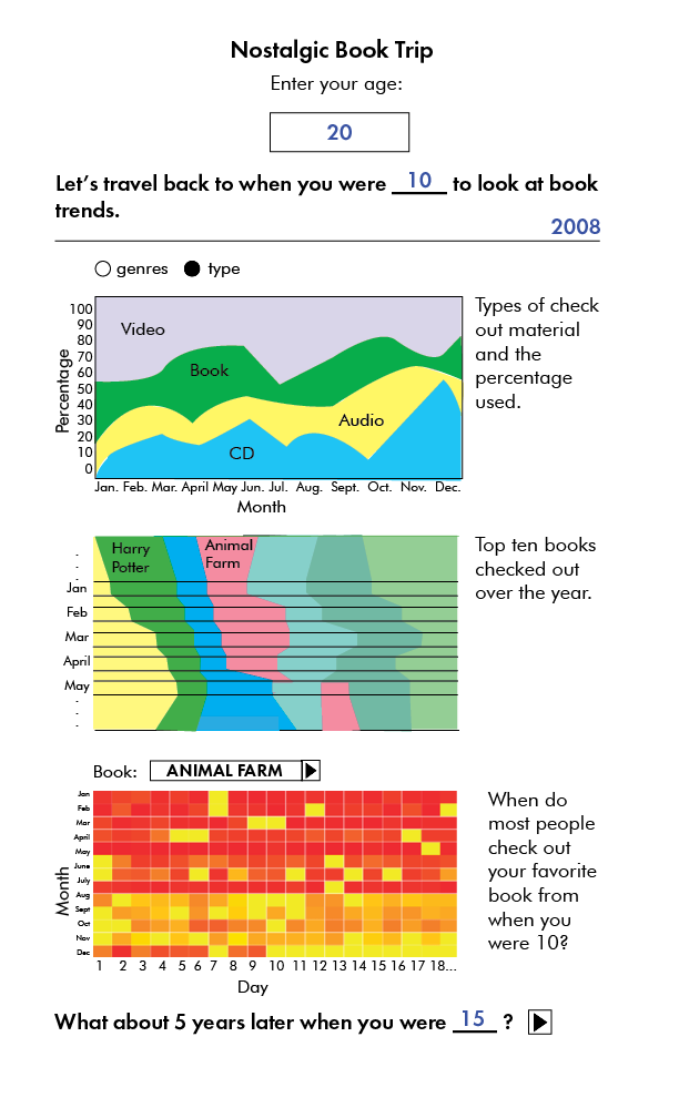
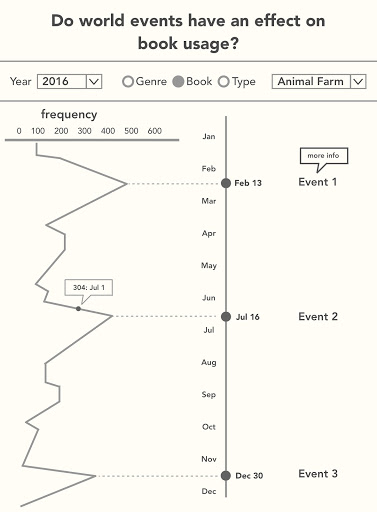
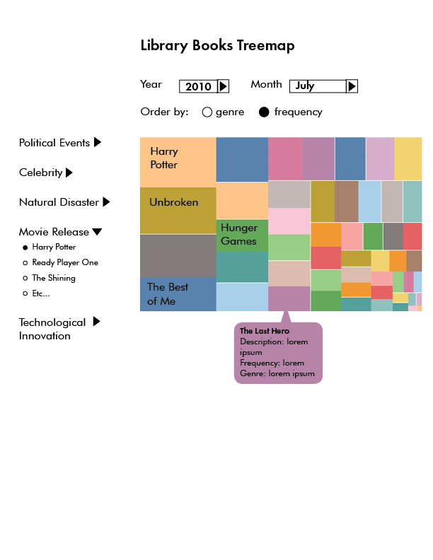
We brainstormed as a group and then narrowed down onto 4 design concepts (2 single page visualizations and 2 mullti-coordinated view visualizations). They are displayed below.
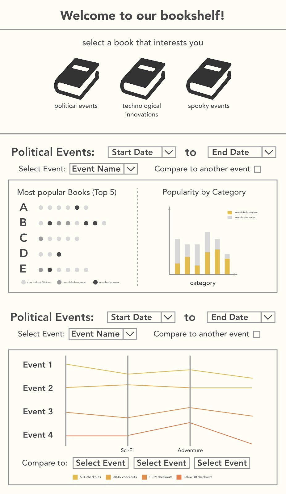
Feedback Session
To test our ideas, we held a poster session to get feedback from classmates, TAs, and the professor. Based on this feedback, we found that people liked the idea of a nostalgic book trip the best. However, we also were told that our dataset really supports an exploratory visualization which required a broader scope than that offered by the nostalgic booktrip. Taking this advice into consideration, we continued to work on cleaning our dataset and moved towards coding our final design.
Final Product
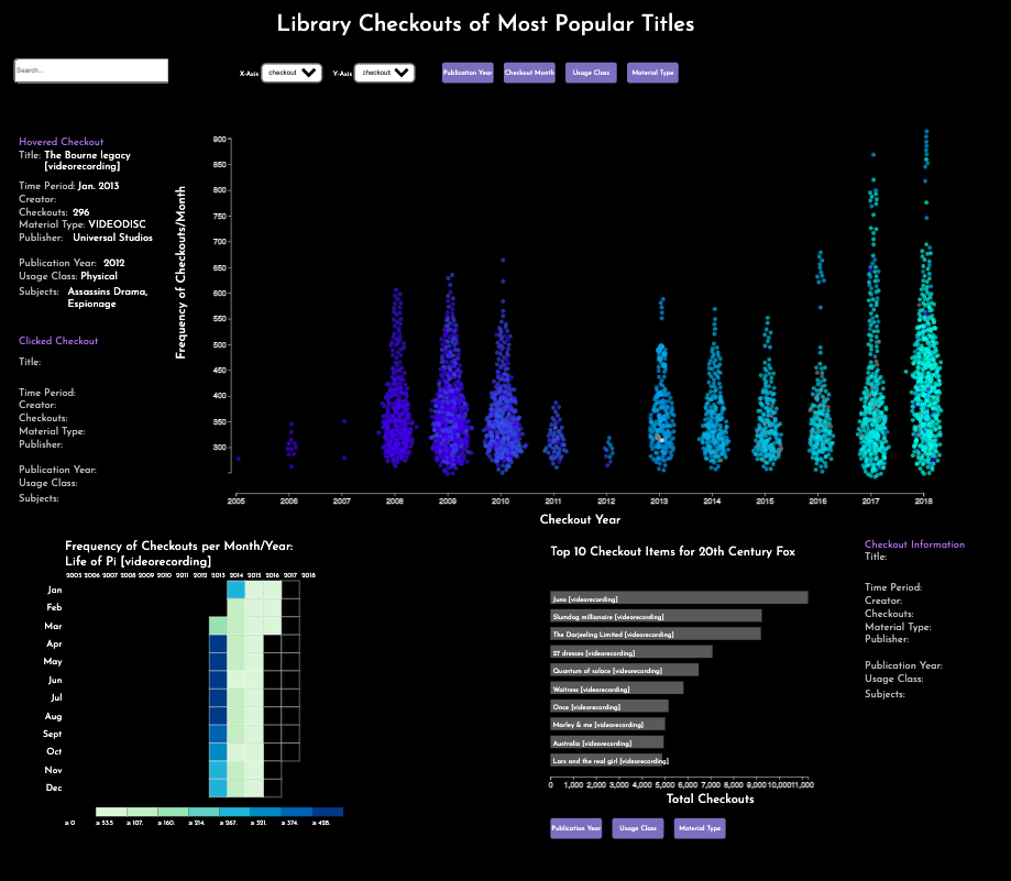
The video gives an overview of our system, which takes the form of a scatterplot with dynamic axises, in addition to a heatmap for frequency of checkouts over time and a bar chart to show an creator's most popular works.
To explore the visualization yourself by clicking here. These requirements should be met to properly view the viz:
- Use Google Chrome
- Turn off adblockers
- Zoom out if you cannot see all parts of the viz