Digital Games for Athlete Rehab
Project Overview
Utilized multiple user research methods to understand the challenges of athletes undergoing post-injury rehabilitation and physical therapy to create a prototype for two balance games that used Unity 2D and a Wii board to offer fun physiotherapy.
Advisor
- Bruce Walker
My Role
- Research Methods
- Design Methods
- Unity 2D/C#
- User Testing
Problem Discovery
Context
Began by conducting a literature review and competitive analysis to understand the problem space more thoroughly.
Athletes frequently get injured, especially in high-contact sports, and often need to undergo a long and difficult physical therapy process to return to their normal activity level. During the physical therapy process, patients often are encouraged to complete exercises at home. However, home exercises do not have therapist supervision and there is no way to know if exercises are being completed correctly.
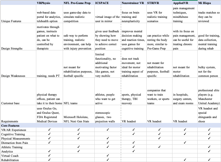
Injured athletes can speed their recovery time and reduce the chances of reinjury by staying motivated and consistently adhering to recommended home exercise guidelines. Technology has the capability to impact these success factors. Below is a competitive analysis of the current technologies attempting to address the issue.
Survey
Primary research for this project began with a survey. The goals of the survey were the following:
- Identify the target user population and their characteristics
- Identify current pain points athletes face during rehab
- Determine what current methods are for recovery
- Uncover what motivates athletes during recovery
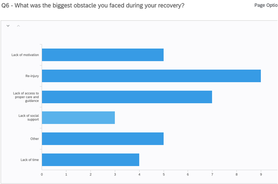
The bar graph above gives insight into the largest pain points for athletes during recovery. Reinjury was the most common obstacle cited, followed by lack of access to proper care and guidance and lack of motivation. From all the survey results, I discovered primary user tasks. The participants wanted to avoid re-injury and recover fully before returning to sports. They needed more access to proper care and guidance, and they needed to accurately self-assess if they can try different actions (pushing boundaries vs. overstepping them). Finally, they needed proper motivation to meet recovery goals in the time they expected.
Interviews
I next conducted interviews to get a deeper understanding of what athletes struggle with and their typical process during recovery. The main information goals were the following:
- Understand the role of sports in the athlete’s life
- Understand what rehab activities were undertaken
- Understand athlete’s attitude towards their injury and their recovery
- Find out how an athlete decides to test & push their boundaries
- Have clear picture of the resources and tools the athlete had access to
- Understand in what circumstances they experienced the lowest motivation
I recruited 5 participants, all young adult soccer players who had experienced a lower-leg injury lasting more than one month.
Personas
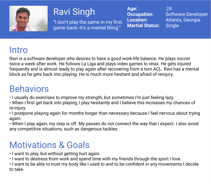
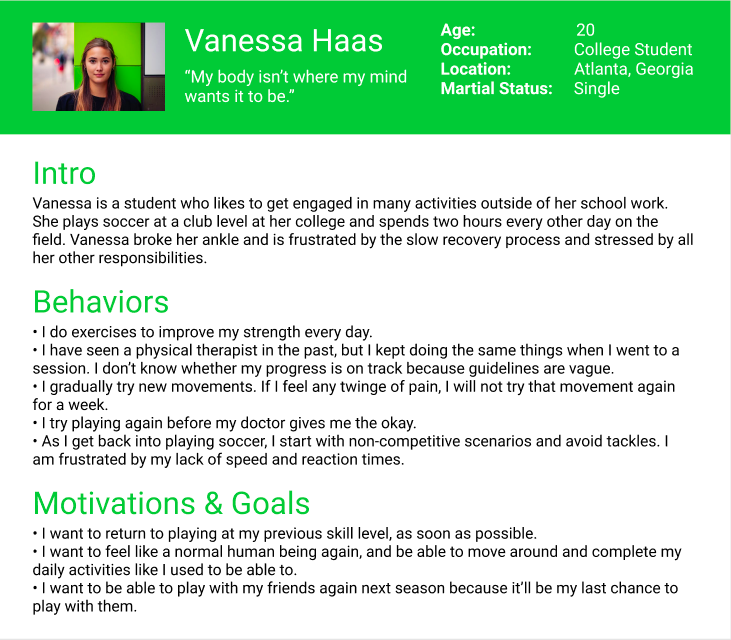
To analyze the data, I created an affinity map that helped me categorize common themes among the responses. I From there, I created two personas to help empathize with users during the design phase. one persona represented some of the mental challenges during recovery (lack of confidence and motivation, depression, stress) and the other represented the physical challenges (pain, weaker and slower than before).
Journey Map
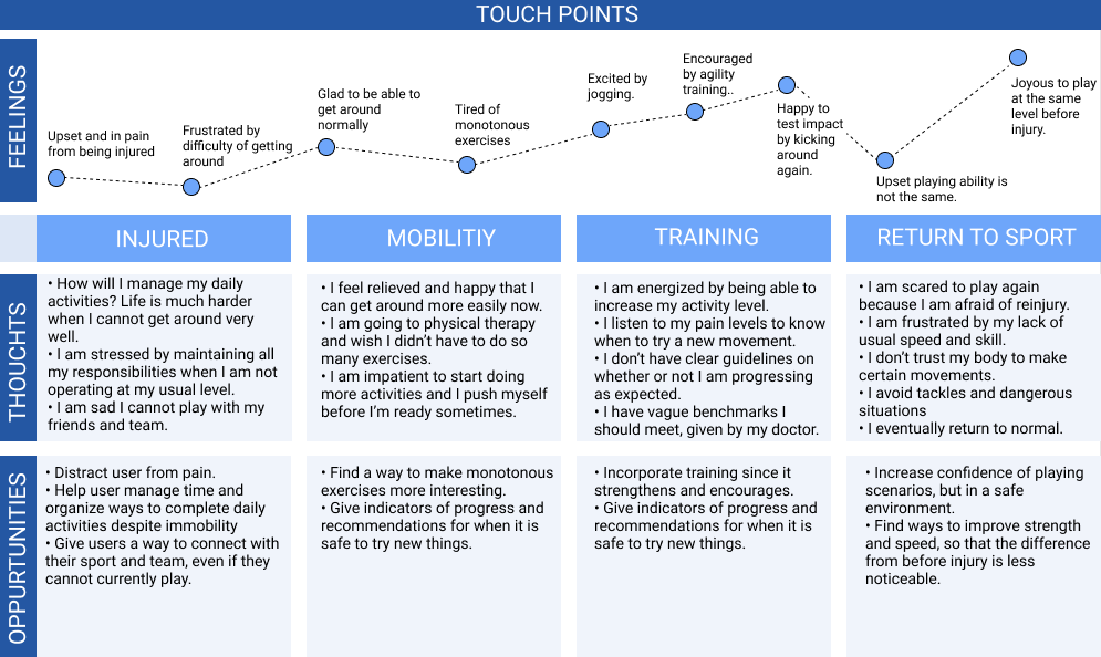
I also used the affinity mapping insights to create a journey map (displayed below) based on the results to fully understand the process of recovery and the different pain points along the way.
Design
3 Concepts
Based on design implications I defined on the research I had done, I came up with 3 intitial solutions.
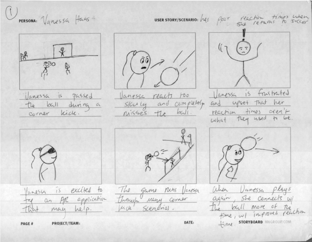
Idea #1: VR Game to Aid Reaction Time
The first concept was a VR game that put a user in a realistic, virtual game scenario. The core idea was to give players an alternative to returning to sports too soon by allowing them to practice key skills in a safe environment.
Idea #2: VR Game to Aid Balance
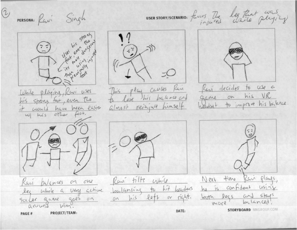
The second concept was a VR game that focused on balance training. The core idea of this design was to improve a player’s balance, since balance exercises were often mentioned as an important part of recovery during the user interviews.
Idea #3: Tracking Recovery App
The third concept was an app that would allow the user to track the progression of their different skills over the course of their recovery. Data could be imported from the VR games or the user could manually input stats. The core idea for this design was to give the user very clear guidance and feedback on where they are in their recovery process.
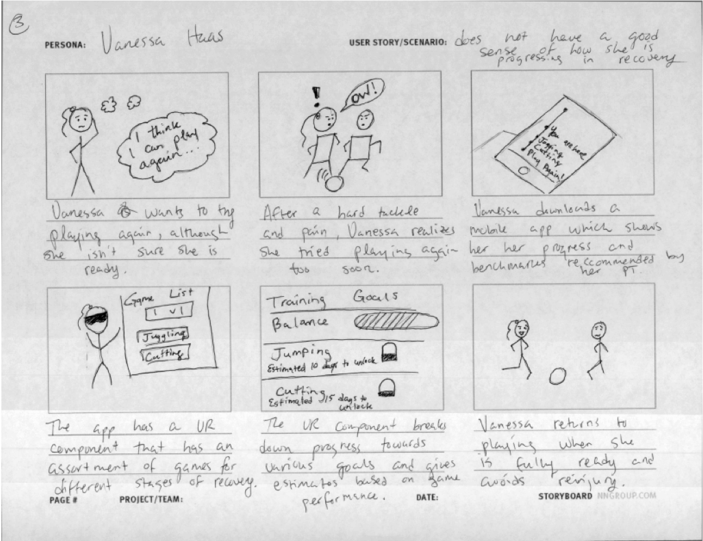
Based on analysis of the feedback, I moved away from concept 1 (VR + Reaction Time) because the possibility that lots of movement could cause injury is a severe downside, especially when the purpose of the application is to help athletes recover. I decided to combine concept 2 (VR + Balance Training) and concept 3 (Recovery Tracking App). The balance game could be a fun way to improve an athlete’s balance, while an app could pull in data from the balance game and allow for user input to give users a good sense of their recovery progress.
First Prototype and Removing VR
After deciding on the balance game plus app combo, I prototyped a simple balance game with the Wii board and Unity. The user stands on the Wii board and can shift their weight to move a soccer ball around obstacles on a laptop screen. The UI for this prototype is shown below.
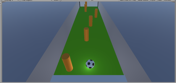
The users I tested this with mentioned that since the board is flat on the ground, one could do single-leg stands and try to move the other leg around as one keeps balance. Another key insight I obtained is that neither participant saw the VR aspect as necessary—they would be fine with simply having the visual on a screen. Additionally, if they were in a VR environment and lost balance, they would want to be able to see so they could grab onto something. Based on this feedback, I decided to remove the VR component and focus on designing a balance game that used beneficial balance exercises as input.
Expert Interview with Physical Therapist
To ensure the physical movements required by the game would actually be beneficial for improving balance, I interviewed a physical therapist about best practices. The information goals were the following:
- Find out what balance exercises could be used as input on the Wii board (number of repetitions, amount of time, exact pose)
- Find out accurate ways to measure different poses
- Discover who these balance exercises can help and for what injuries they are commonly used
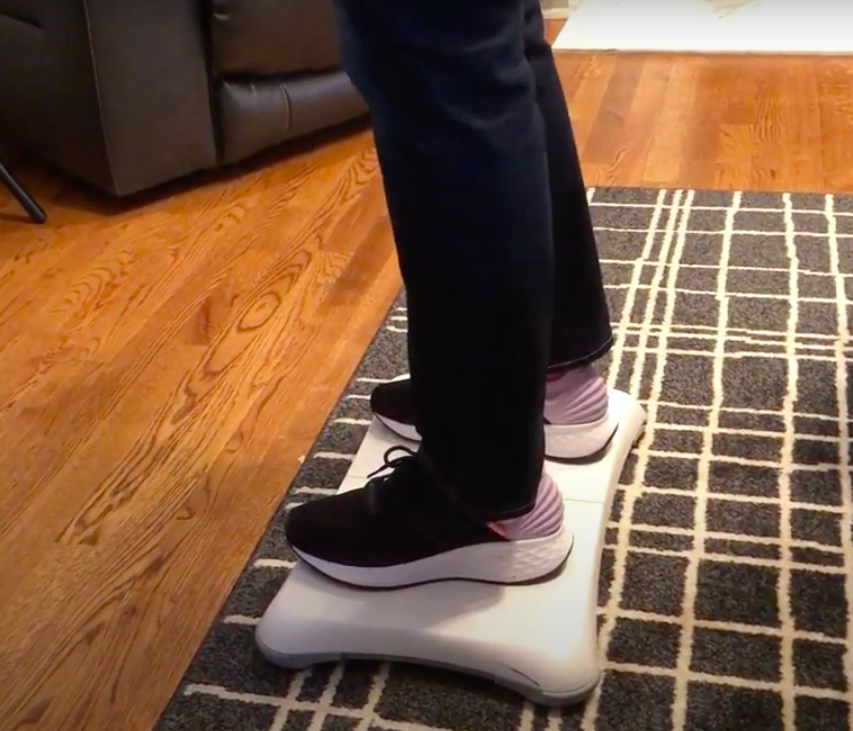
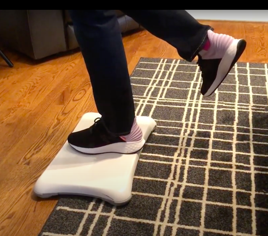
The physical therapist explained an array of different potential exercises. I decided to focus on two of these exercises that are compatible with standing on a Wii board: single leg standing and weight shifting. Additionally, doing any of these exercises with closed eyes makes them much more challenging.
Game Design that Incorporated Feedback
Given the information from the physical therapist and the earlier feedback session on my first prototype, I designed a 2D balance game that would incorporate single leg stands and weight shifting. I shifted from 3D to 2D because it was easier to map the balance motions to 2D player movements. The image below shows the basic mechanics of the game I was envisioning, based off a classic Donkey Kong platformer game.
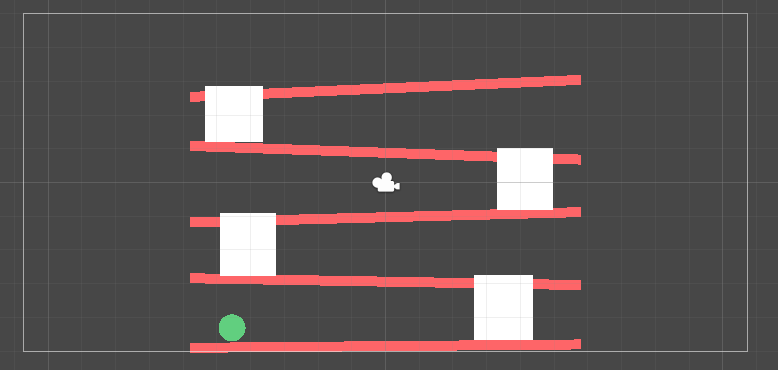
As a player shifted right, the ball would move right. Shifting left moved the ball left. To get to the platform above, a player would have to do a single leg stand when they reached the white block, or the “ladder”.
In addition to the UI, I wanted to experiment with different mediums for this game. For example, to make it more mobile than current Wii games, it could be a game a user plays on their phone. It could also forego the visual completely and the game could be converted into an audio-only experience that guides the user’s balance movements through navigational sounds.
Game Design Feedback Sessions
To understand perceptions of the new 2D game design and potential game mediums, I held another feedback session with 3 users. I showed them the simple Donkey Kong inspired interface and explained how there could be different versions of the same game (tv, mobile, or audio-only) and then asked follow-up questions. The main insights were:
- Donkey Kong style game was engaging and useful since it required single-leg stands.
- Audio-only version could be interesting as long as cues were informative enough.
- Ensure the pacing was reasonable by having adjustable levels or slowing the speed of the player as they approach the ladder.
- Have checkpoints because starting over from the beginning would be very frustrating.
- Mobile was not a popular option because people sometimes need their arms to balance and that action would be very difficult if they were holding their phone at the same time.
- Audio-only version might not be very motivating or interesting if they were just beeps.
Improved UI and Gameplay
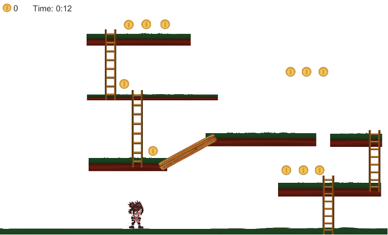
After the feedback sessions, I decided to move forward with the tv version of the Donkey Kong inspired game and the audio-only version. However, I focused on creating the visual version first. The image below shows the new UI.
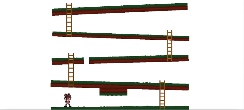
The weight shifts control the girl the same way they did the ball in the previous iteration: left shift moves left; right shift moves right. Ladders on the right side of the screen required players to do a right-leg balance stand, while ladders on the left required left-leg balance stands.
I added two new movements to make the game both more interesting and more beneficial for rehab. To duck under the block on the first level, a user must do a squat. To jump on over the gap in the platform on the third level, a user must do a heel-raise.
Physical Therapist Feedback Round II
With the improved 2D game design, I decided to get feedback from a physical therapist again. Key insights included:
- The physical therapist said that they require these balance exercises for almost all their patients who need to work on balance, they are not dependent on different conditions.
- The physical therapist explained that displaying a timer would not be dangerous, but rather useful because an improved time would mean improved balance. It could be nice motivation, while also showing them their progress.
- Suggestions for changing the game to be more or less challenging would be to change the steepness of the platform inclines, change the length of the ladders, and change the number of heel-raises or squats required.
Final Prototype
Visual Version with Non-Navigational Audio
This version of the game was the most like a standard Wii balance game. It builds on the visuals and gameplay from the last game with additional game mechanics.
The squat was removed for purely technical reasons—the Wii board was not reliably picking up on a squat motion. New additions include a coin counter for motivation and a display of the time, since the physical therapist affirmed time would be a good indication of success.
Below is a demo of myself playing the game by using the Wii board (you can see me in the top right corner).
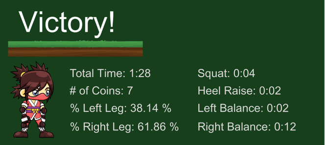
At the end of the game, I added a results screen that gives a player a breakdown of their performance and give them a sense for how they are progressing over time, since these factors were shown to be important earlier in the research phase. It shows total time, number of coins collected, the percent time that weight was shifted left or right, the amount of time squatting, time doing heel raises, and time doing a left or right single leg balance.
Visual Version with Navigational Audio
This version has the exact same graphics and gameplay mechanics as the first version, including the main play screen and stats page, but the sounds are different. They are meant to be navigational clues that let you know what actions you should be taking in addition to the visual cues.
Audio Only Version
This version has no visual component and has the same exact sounds as the second version of the game (and can be listened to in the video demonstration of the second version posted above). The intention of this version is that a player can play the same game without needing visual cues, meaning the audio cues must be informative enough for the player to know what to do.
An advantage to having this type of game would be that there would be less setup involved since there would be no screen. This makes it so that the game requires less setup because you do not need to connect to the tv. The “Audio Only” version also would allow the player to try the game with their eyes closed, for an extra balance challenge.
Evaluation
Method
Initially, the plan was to recruit young adult athletes (age 18 – 25) who play high-contact sports and who are susceptible to the kinds of lower-leg injuries that would require balance training during recovery. Due to the Covid-19 situation, I was only able to recruit my 2 housemates and myself for in-person testing. Therefore, the following results should be taken with a grain of salt, but they do give a sense of how the games compare to each other.
I conducted three sessions with each participant, one for each version of the game. I gave instructions, had them step onto the Wii balance board and then started the game. After the game, I gave the participant two questionnaires: the NASA-TLX to measure workload and the BUZZ audio Questionnaire to measure the effect of the sounds.
Results
The NasaTLX averages across participants are shown in the graph below.
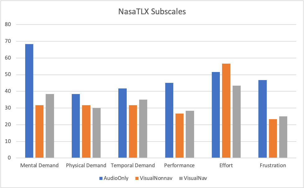
The “Audio Only” version required higher mental demand of participants and caused higher frustration. On most subscales, the “Visual with Non-Navigational Audio” version and the “Visual with Navigational Audio” version performed similarly. However, the “Visual with Navigational Audio” took the most effort of the three versions.
The amount of time it took for different game metrics is shown below.
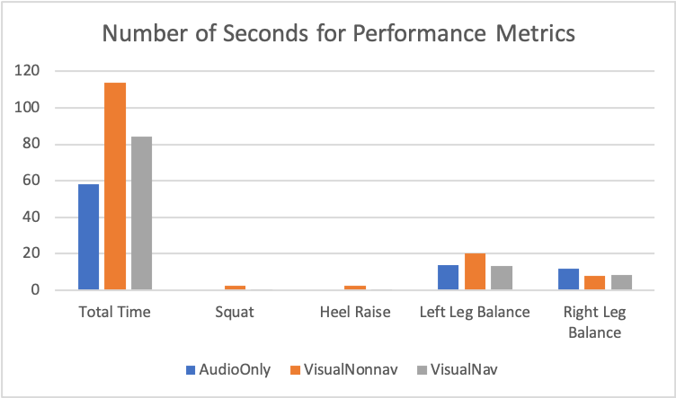
There tended to be a higher amount of time spent on left leg balances than right leg balances across all versions of the game, and hardly any time spent on squates and heel raises.
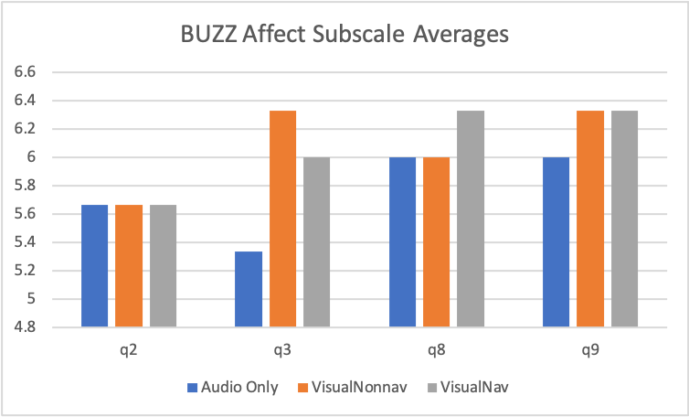
All versions scored the same on how interesting the sounds were (q2). The “Audio Only” version sounds scored low on pleasantness (q3). The “Visual with Non-Navigational Audio” version scored highest on pleasantness (q3) and scored above 6 on questions 8 and 9, which evaluate level of fun.
Based on these results, I concluded pleasant sounds make the game more fun: Participants tended to rate the “Visual with Non-Navigational Audio” as most fun because they liked these sounds the best
Planned Improvements
Based on these results, there are many improvements I could iterate on in the future. The top three improvements I would prioritize would be the following:
- Working with a sound designer. A weakness I discovered through evaluation is that the sounds across all versions were not as strong as they could have been. I also want to work on making the navigational cues more useful as a whole.
- Adding different levels to the game or adding different types of games that could be played. In the review of current research, being able to change the level of difficulty and having variety was mentioned as a benefit to using technology in rehabilitation.
- Make a companion app that connects with the Wii games. This idea was part of my concept generation earlier in the design process, but I decided to focus my full attention on the balance game itself. Now that the foundation for a balance game is built, it would be nice to have an app to keep track of the data generated by the balance game. In this way, a user could truly be able to keep track of their balance as they go through the recovery process. Additionally, the “Audio Only” version could be incorporated directly into this companion app. The user could connect the Wii board to their phone, put their headphones in, and begin playing.