Covid-19 Contact Tracing Dashboard
Project Overview
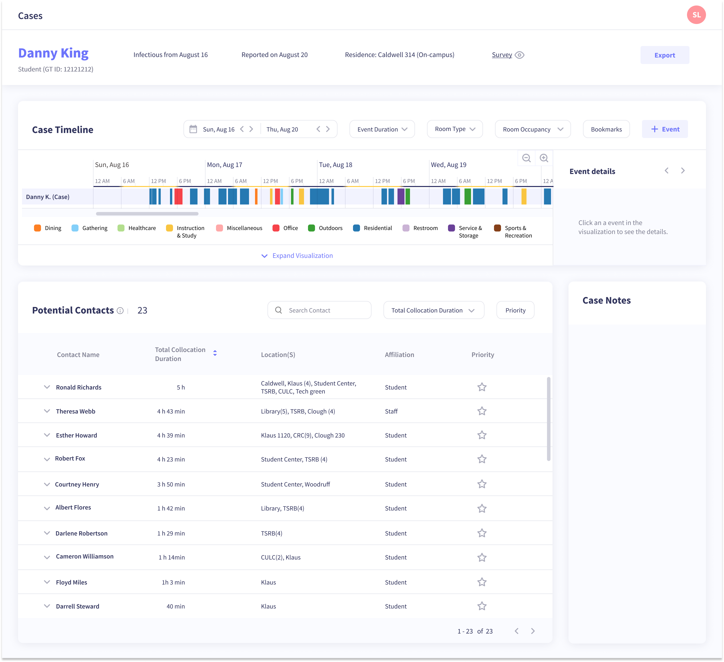
Joined an existing research group that was leveraging WiFi data to help with contact tracing efforts on Georgia Tech campus before the Fall 2020 semester started. My team's role was to create an intuitive contact tracing dashboard for contact tracer's to best utilize this WiFi data to prioritize a case's contacts and therefore slow the spread of the virus.
Team Members
- Soumya Pachigolla
- Tanuja Sawant
My Role
- UX Design
- Persona
- Wireframes
- UX Research
Research
Context
Over the summer, it quickly became clear that Covid-19 would not disappear in time for the fall semester. Georgia Tech, like many colleges, needed a plan for safely welcoming students back to campus. From the start of this project, we were confronted with uncertainties. Our users, Georgia Tech contact tracers of Covid-19, did not exist yet. We did not know what their background would be, how their team would function, what tools they were already using, or what information was most important to them. With a tight timeline, we had to make design decisions when there wasn’t enough information to make decisions. To fill in our knowledge gaps and to make the smartest decisions possible throughout the project, we focused on good communication with key stakeholders, fast iterations of the prototype, and integration with the data visualization team.
Stakeholder Interviews
We participated in discussions with multiple stakeholders to quickly get familiar with the topic space and understand how the flow would work for contact tracing at Georgia Tech. Stakeholders included a contact tracer of 18 years who gave us insight into the most important information contact tracers need access to and the head of the Georgia Tech health center (Stamps) who gave an overview of their most up to date strategy to form a contact tracing team and how coordination would work with the Department of Public Health (DPH). Our preliminary understanding of the contact tracing flow is shown below.
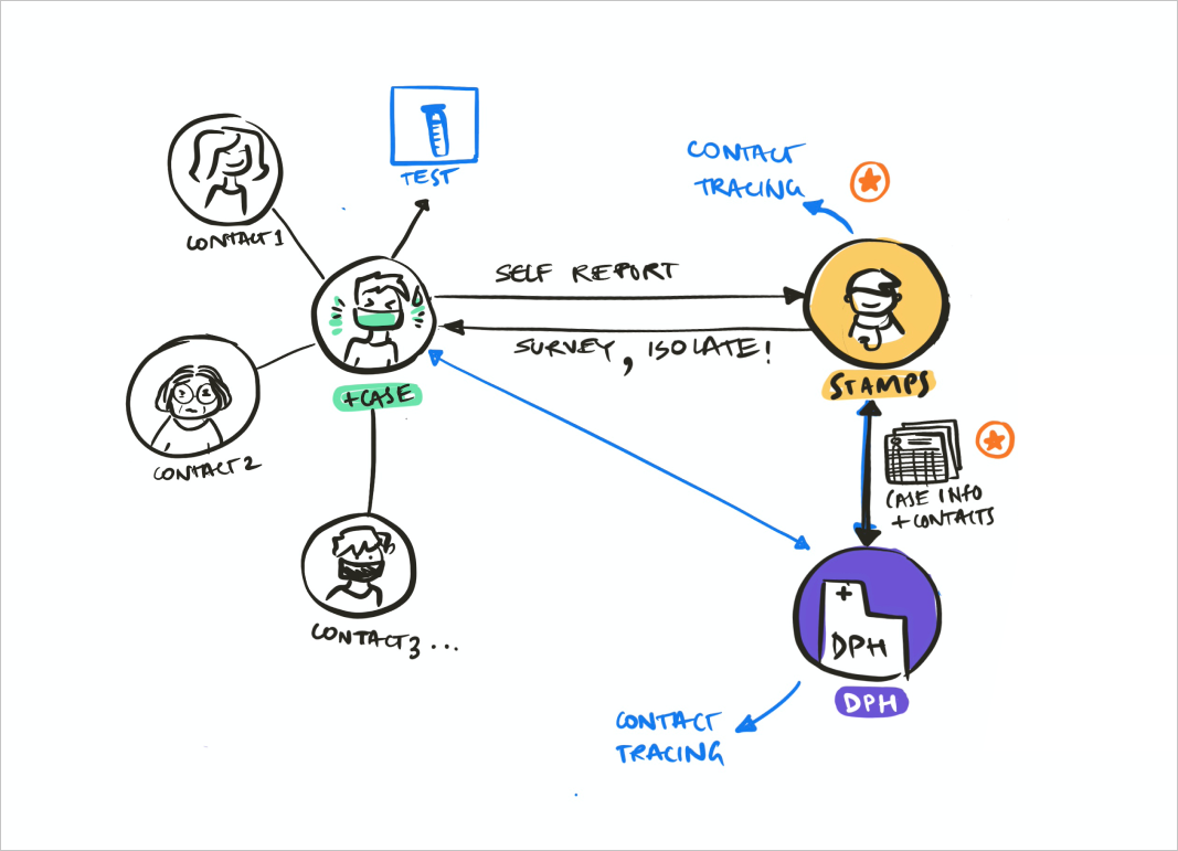
People who tested positive for Covid-19 would self-report the case to Stamps, the health center. Then Stamps would send a survey to gather basic information about the person and the last time they were on campus. Then Stamps would perform contact tracing and send information about the case and their contacts to DPH.
Persona
We used information gathered from stakeholder interviews to create a persona for a contact tracer, which helped us make design decisions from the user's perspective.

Journey Map
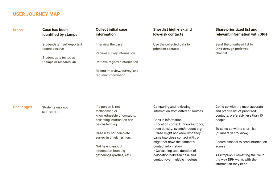
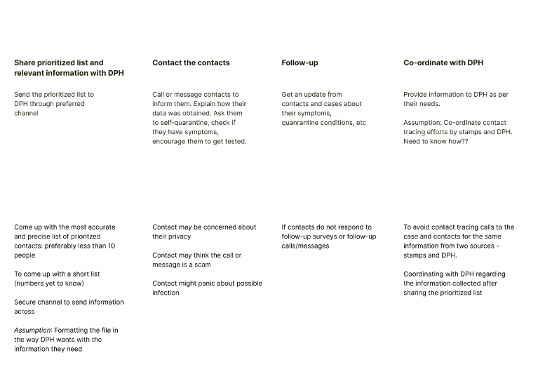
Next, we constructed a journey map to drill down into the individual steps of the contact tracing process and pain points for each step.
Design
Early Iterations
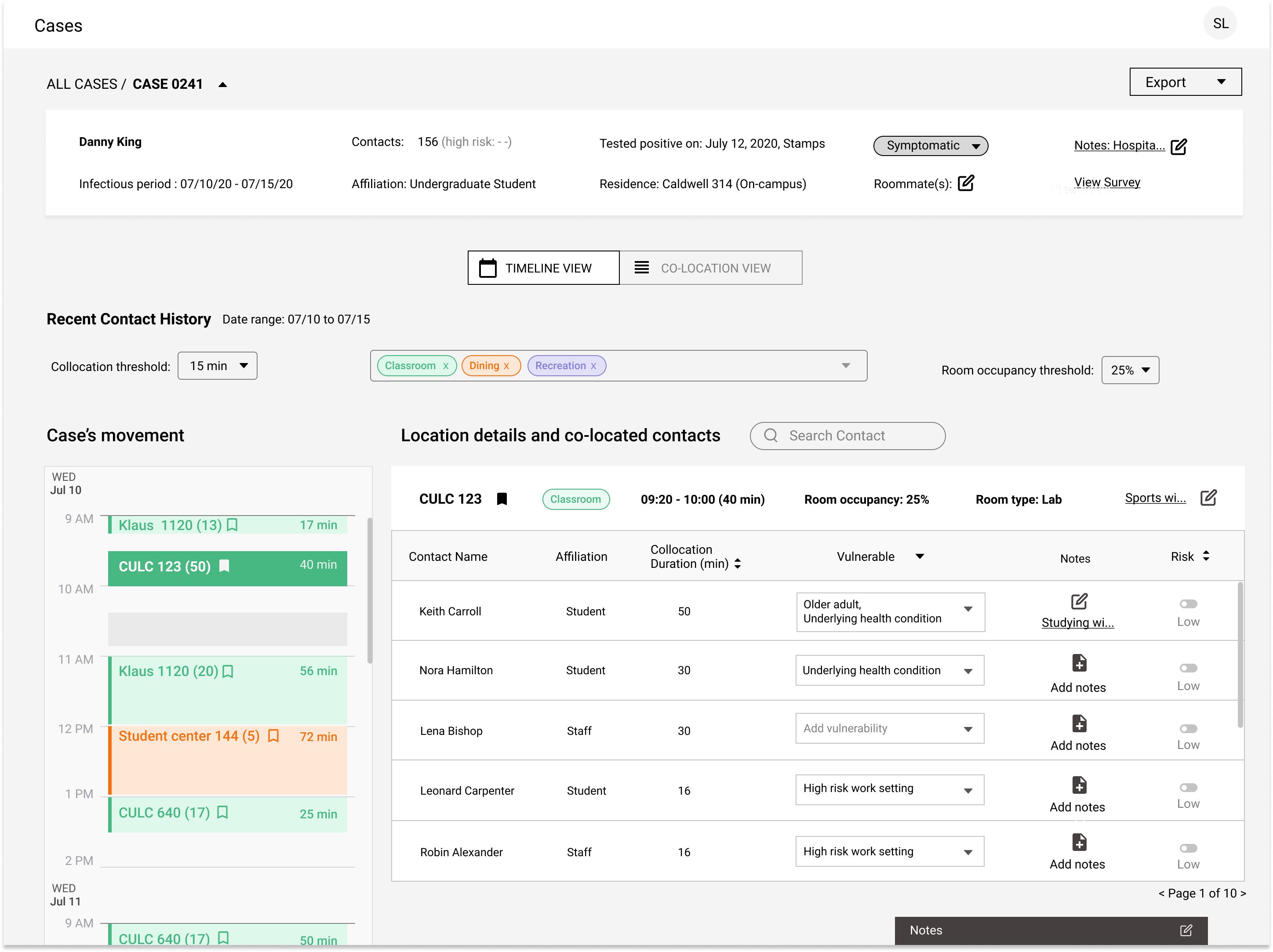
Initially, we had the dashboard separated into two views. The first was a calendar view, where a contact tracer could view the different locations a case had been to based on their WiFi data and then a list of contacts for each location. The idea was that a contact tracer could walk through a case's schedule while on the phone with them and fill in any gaps of where they had been.
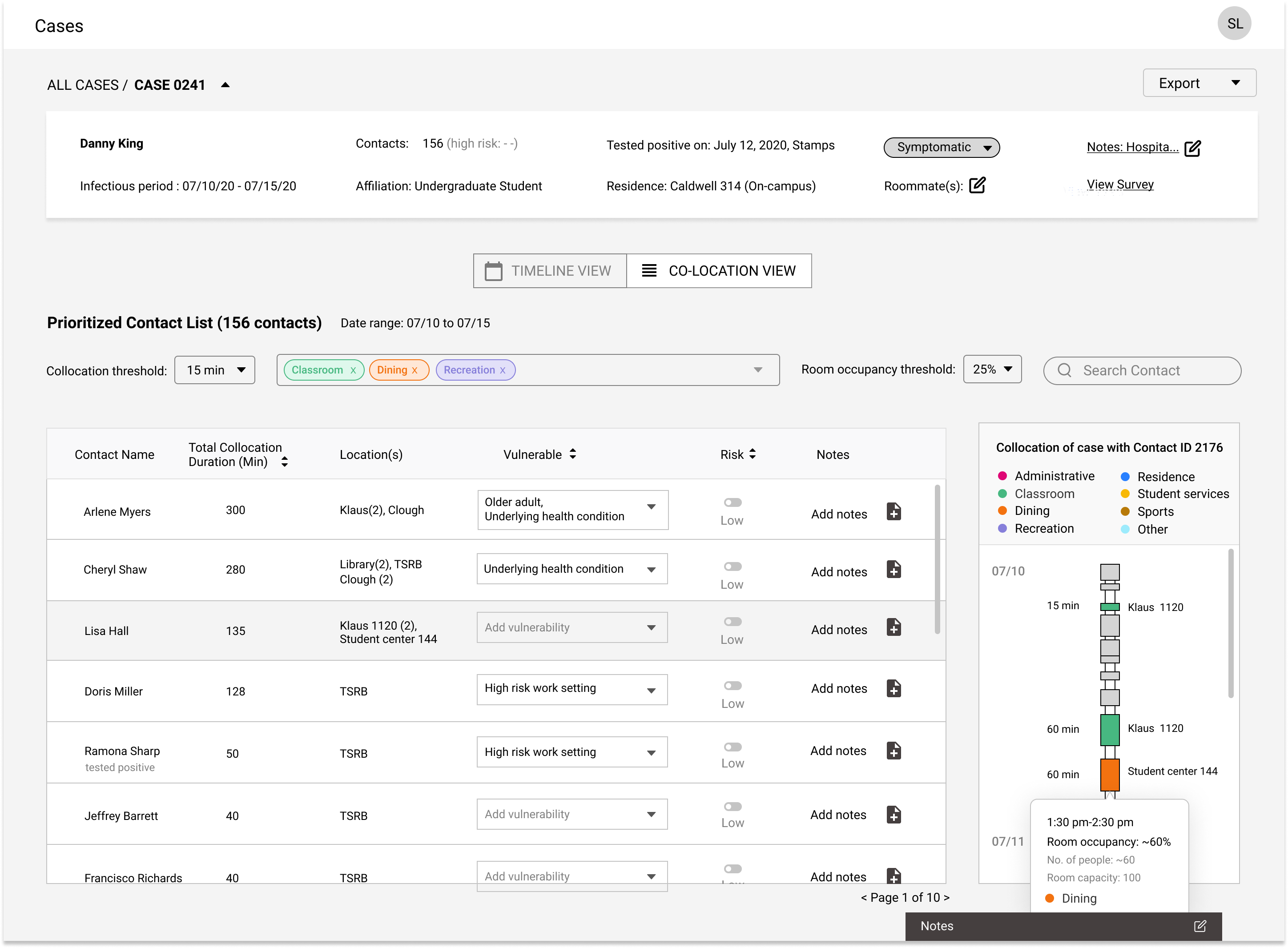
The second view, meant for after a contact tracer had finished their phone call with the case, simply displays a case's contacts. It is prioritized primarily on the amount of time the contact had spent in proximity to the case, called co-location duration. We also had added other filters for prioritizing contacts, such as whether contacts were considered highly vulnerable.
Design Pivot
After a usability session with our mockups, we realized the split view format was confusing. There was overlapping functionality between the two screens and it was unclear how modifying data on the calendar view would affect the data on the table view. To resolve this confusion, we decided to consolidate all the information into a single view.
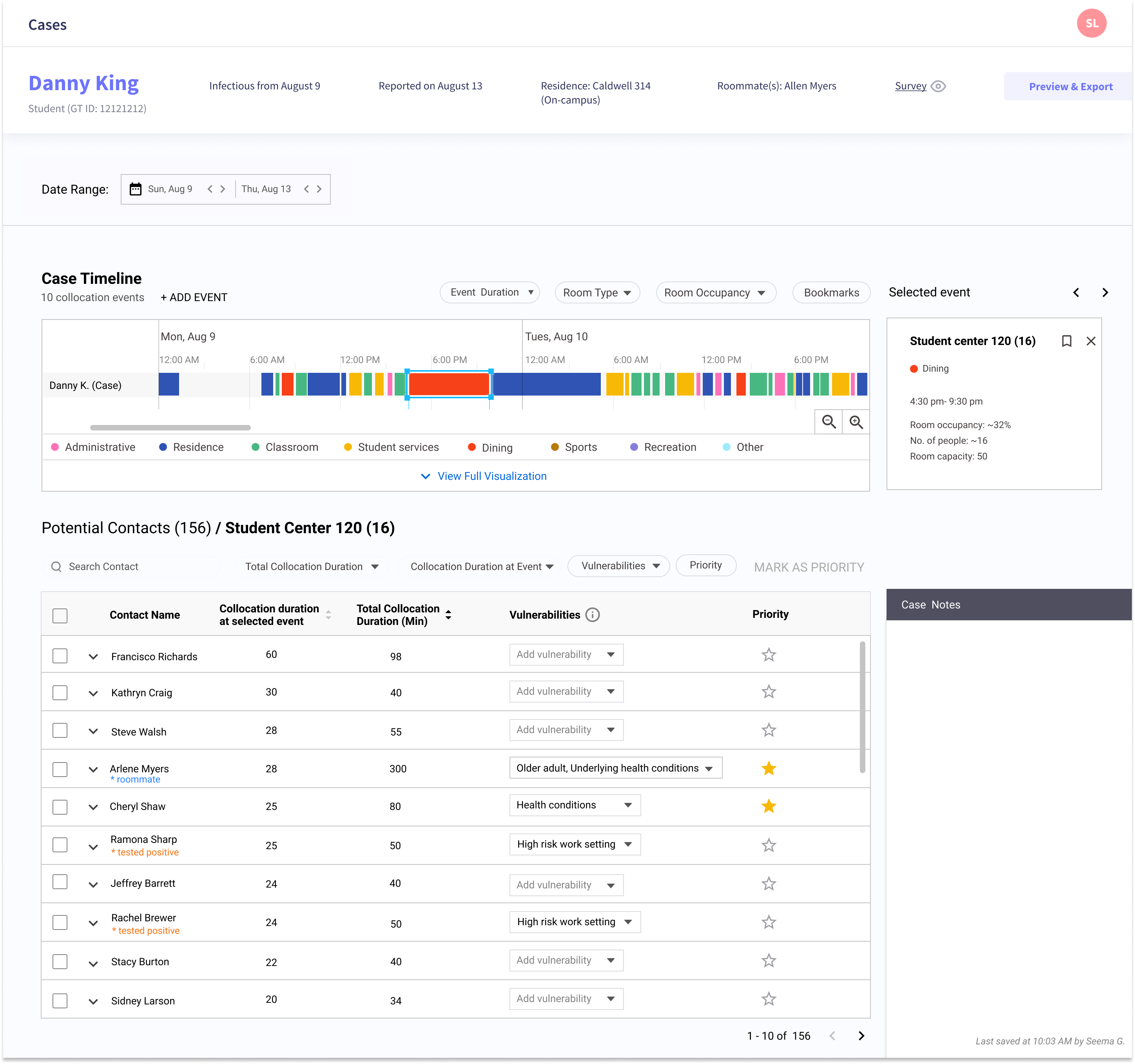
This view had a case timeline at the top, that gives a quick overview of the types of places a case has been over the course of their infectious period. If a contact tracer clicks to view the detail within the timeline, the overall list of prioritized contacts will update to show only contacts who were at that location at that particular time. There are multiple filters a contact tracer could employ, such as room type or room occupancy. The goal of the dashboard was to give the contact tracer enough information to mark which contacts are the highest priority. Then they could export that shortlist to DPH for further contact tracing.
Integration with Data Visualization Team
Another team was developing a data visualization of collocation data of cases and contacts at the same time we were building the design for the contact tracing dashboard. We realized that our ideas had some overlap and functions that could complement each other. We decided to incorporate their visualization as an optional extension of the case's timeline.
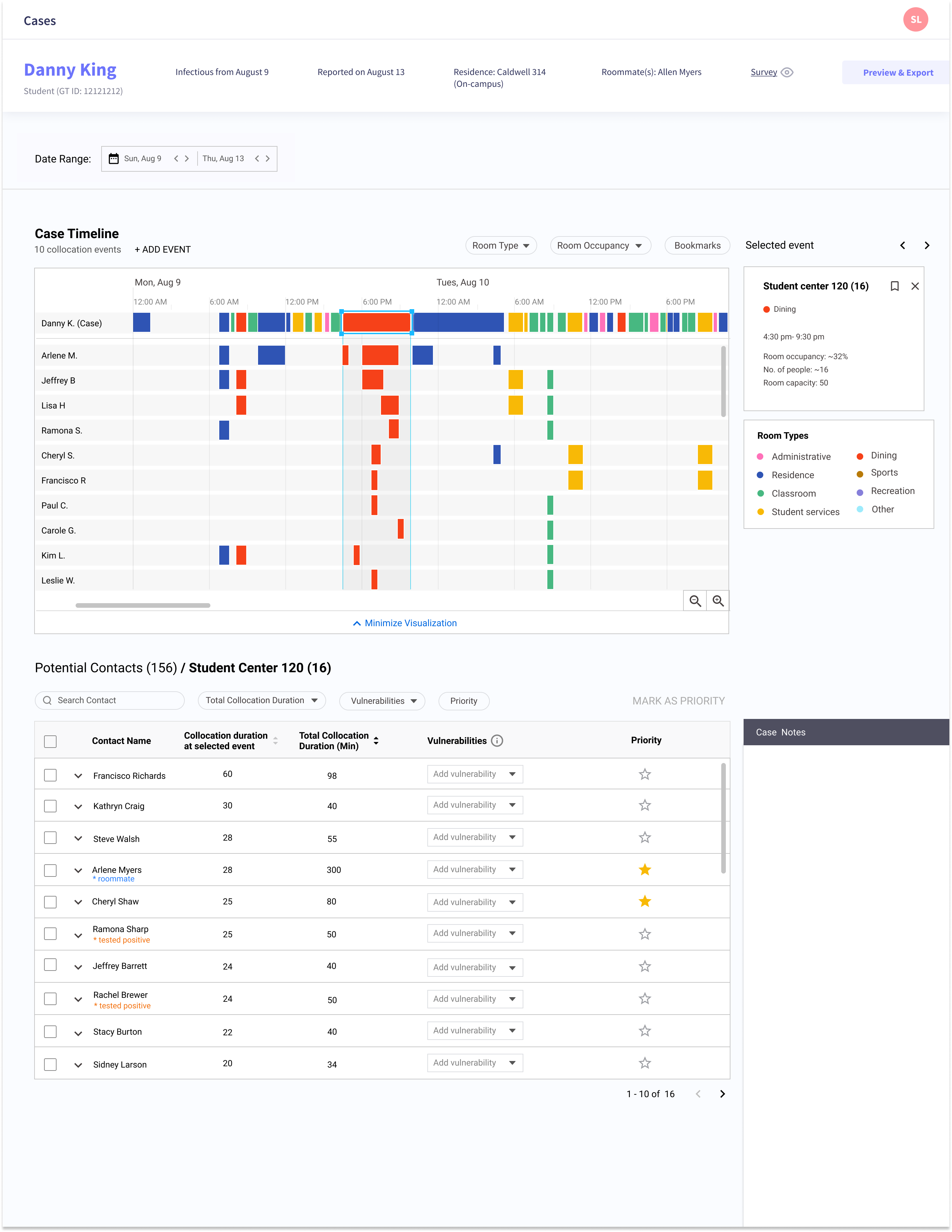
The purpose of the visualization was to show trends in whether the same people were meeting at similar types of events that may have been high risk. It could help contact tracers identify clusters and problem areas within campus that need extra attention.
Next Steps
I left the project before it was complete. The next steps were polishing the UI and then passing it off to the development team. One way we could have improved would have been to focus on a minimal viable product (MVP), considering the short timeline. The prototype we developed, while thorough and useful, had many features that were difficult for the development team to bring to life in such a short time span. Starting with a more basic system and then building upon it later on may have been a more beneficial approach in this situation.